


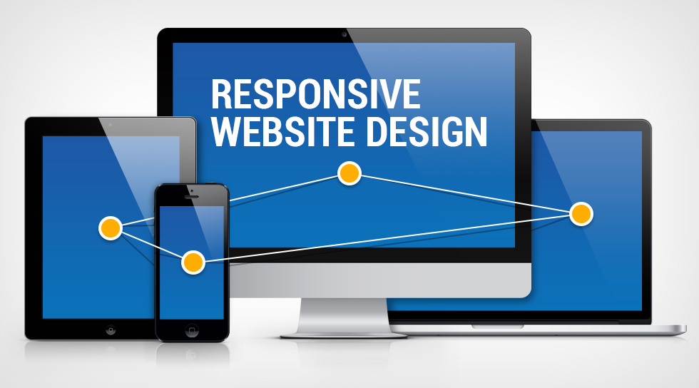
How to create Responsive Web Design via freeCodeCamp
Creating responsive web designs is a crucial skill for modern web developers, as it ensures that your websites look and function well on various devices and screen sizes. freeCodeCamp offers an excellent course on Responsive Web Design that covers the principles and techniques needed to achieve responsive layouts. Here’s a general outline of what you can expect from the course:
-
Introduction to Responsive Web Design:
- Understand the importance of responsive design and how it improves user experience.
- Learn about fluid grids, flexible images, and media queries.
-
HTML and HTML5:
- Review or learn about the HTML elements and structure needed for building web pages.
- Explore the new features introduced in HTML5 that support responsive design.
-
CSS and CSS Flexbox:
- Learn how to use CSS for styling and layout.
- Dive into CSS Flexbox, a powerful layout model that simplifies building responsive designs.
-
CSS Grid:
- Explore CSS Grid, another layout system that offers more advanced control over your design’s structure.
- Understand how to create complex layouts using rows and columns.
-
Responsive Web Design Principles:
- Study responsive design principles, including mobile-first design, scalable images, and relative units like percentages and ems.
-
Media Queries:
- Learn how to use media queries to apply different styles based on screen size and device characteristics.
- Create responsive breakpoints for various devices.
-
Viewport Meta Tag:
- Understand the importance of the viewport meta tag and how it affects the initial display on different devices.
-
Responsive Typography:
- Learn how to make text content adapt to different screen sizes and maintain readability.
- Explore techniques for adjusting font sizes and line heights responsively.
-
Responsive Images:
- Dive into responsive images by using CSS to control image sizing and behavior.
- Explore techniques like the
max-widthproperty and thesrcsetattribute.
-
Accessibility and Best Practices:
- Understand the importance of web accessibility and how to design your responsive sites to be inclusive for all users.
- Learn about responsive design best practices and optimization.
-
Mobile-First Design:
- Explore the concept of mobile-first design and its benefits.
- Learn how to design and develop for smaller screens before expanding to larger ones.
-
Testing and Debugging:
- Learn how to test your responsive designs using browser developer tools.
- Debug any issues that arise in different screen sizes.
-
Responsive Web Design Projects:
- Apply your knowledge by working on hands-on projects that involve creating responsive layouts and features.
The freeCodeCamp Responsive Web Design course consists of a series of interactive lessons, coding challenges, and projects. By completing this course, you’ll gain a solid foundation in responsive web design techniques and be better equipped to create websites that provide a great user experience across various devices.